

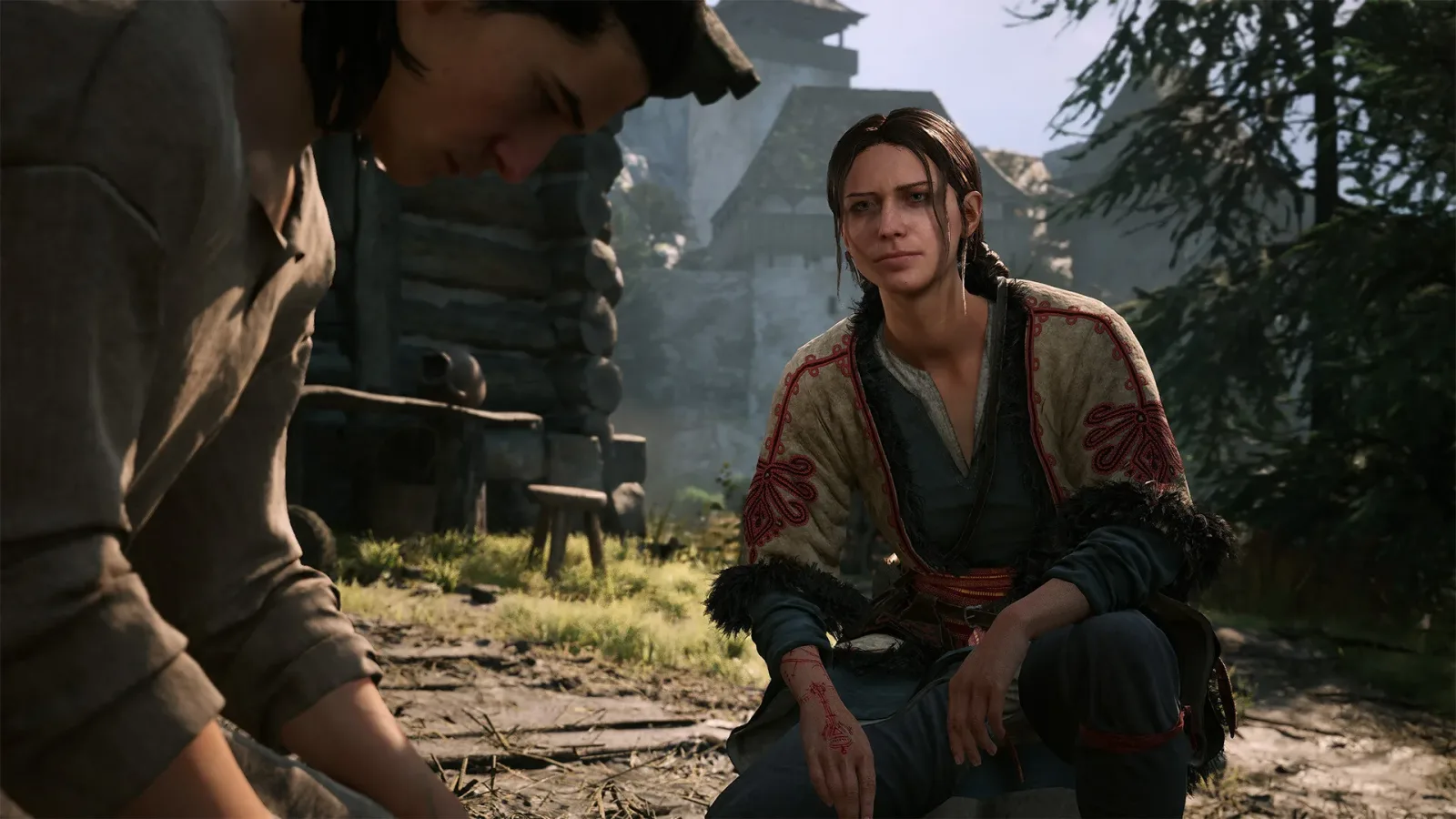
Blood of the Dawnwalker appears to be built around the kind of open-ended adventuring that can happily derail a plan. Set out to handle one quest, encounter a distraction on the road, chase that lead into another area, and suddenly an hour has disappeared. For players who enjoy a dense world full of combat, side activities, characters, and unexpected detours, that sense of being swept away can be a major part of the appeal.
There is an important difference, however, between getting lost because a game's world is compelling and getting lost because its navigation tools create too much friction. One player's experience after roughly 20 hours on PlayStation 5 has highlighted that divide. The game's combat, performances, characters, and story have all left a strong impression, but the simple act of reorienting after a detour has become an ongoing irritation.
The request is not necessarily for a giant, permanent minimap taking over a corner of the display. Instead, it is for a faster, less disruptive way to check where the player is, where an objective lies, and which direction to travel next. It sounds like a small quality-of-life issue, but in a large role-playing game, these repeated seconds of interface management can shape the entire rhythm of play.
Exploration Works Best When It Feels Intentional
Large fantasy worlds often depend on a balance between guidance and discovery. Too much direction can make exploration feel mechanical, reducing the journey to following a glowing line from one checklist item to another. Too little direction, on the other hand, can turn an otherwise exciting expedition into a cycle of pausing, checking a screen, walking a few steps, and pausing again.
For useful background on this topic, read Framework Cuts Laptop Memory Prices and Will Refund Recent Buyers.
Blood of the Dawnwalker reportedly succeeds at making the world feel worth wandering. Traveling toward one destination can lead to another opportunity, while frequent encounters and diversions give the environment a sense of activity. That is exactly the kind of design that encourages players to abandon a direct route and see what lies beyond the next ridge or around the next corner.
But that freedom places greater importance on the tools available when it is time to return to a specific task. A player who has spent a long stretch following side content may need to locate the nearest save point, resume a main quest, or simply determine whether they should be heading east or west. If reaching that information means continually entering and exiting the map menu, the interface starts to interrupt the exploration it is supposed to support.
The problem is especially pronounced for players who do not naturally retain a strong mental map of a game world. Not everybody finds directions intuitive, particularly after combat encounters, elevation changes, branching paths, and a chain of unscripted detours. A system that feels atmospheric and manageable for someone with excellent spatial awareness may feel punishingly opaque for someone else.
The Repeated Map Check Is the Real Issue
On PS5, checking the map involves using the DualSense touchpad to bring up the interface, looking at the destination, closing the map, and then trying to apply that direction in the world. That sequence is reasonable when used occasionally. The frustration emerges when it must be repeated every few moments because a turn was missed, a landmark was unclear, or the player cannot remember the orientation they just checked.
That cadence can become particularly disruptive in Blood of the Dawnwalker because the world is not empty. The player described dealing with groups of more than four enemies at a time, making visual awareness valuable during travel and combat. The game's uncluttered interface has a clear advantage here: it preserves the view of its environments and makes it easier to notice danger. Yet the lack of a quick directional reference means that a strength of the presentation can become a weakness during navigation.
There is also a broader immersion issue. Opening a full-screen menu is a hard break from the fantasy. It asks the player to stop interpreting the road, terrain, and surroundings as part of the adventure and instead inspect an abstract game interface. Once or twice is inconsequential. Do it repeatedly during a short trip, and the process can drain momentum from a quest, an exploration run, or even the search for a place to save and level up.
This is why calls for improved navigation should not be dismissed as a demand to make the game easier. The concern is not that objectives need to be placed directly at the player's feet. It is that the path between wanting information and receiving it currently requires too many inputs for some players.
A Permanent Minimap Is Only One Possible Fix
A conventional minimap is the most obvious solution, and a PC mod that adds one is already being used by some players. The existence of that mod suggests that there is demand for a more immediate navigational aid, especially for those who have already decided that the current map flow does not suit them. For PC players, mods can provide a way to tailor an experience while waiting to see whether an official option arrives.
Still, a permanent minimap is not the only answer, and it may not be the preferred one for every player. A fixed map display consumes screen space, draws attention away from the game's scenery, and can encourage people to stare at icons rather than the world itself. In a sword-and-sorcery RPG that benefits from an unobstructed view, a bulky HUD could undermine the very atmosphere that a navigation improvement is meant to protect.
A better compromise could be an optional transparent map overlay. Rather than fully replacing the game screen with a menu, it could briefly appear over the action, allowing a player to confirm direction without losing all visual context. The overlay could be activated with a single button press, dismissed just as quickly, and offered as an accessibility or interface preference rather than a mandatory addition.
Another possibility would be a subtle pathfinding effect for an actively selected quest. Instead of modern-looking GPS arrows, the game could use an in-world visual suited to its fantasy setting: a faint trail, a temporary magical shimmer, an environmental cue, or another restrained guide. Such an option would allow players to receive help when they explicitly ask for it while leaving exploration otherwise untouched.
Even a dedicated shortcut that opens the existing map more directly would be a meaningful improvement. The player feedback is fundamentally about reducing button presses and menu interruptions. An elegant solution does not need to redesign the whole interface; it only needs to make the most common navigation check less of a chore.
Accessibility Options Can Preserve Player Choice
Navigation aids are often treated as a binary design argument: either a game trusts players to navigate on their own, or it overwhelms them with markers and route lines. In practice, interface settings can accommodate a far wider range of preferences. Blood of the Dawnwalker could preserve its clean default HUD while offering optional tools for people who need a little extra support.
A menu of navigation choices might include a disabled-by-default minimap, a compass that can be toggled on, a transparent overlay, an objective direction indicator, or an in-world guidance effect. Each player could choose how much information is useful without imposing the same experience on everyone else.
This matters beyond convenience. Players can struggle with navigation for many reasons, including differences in spatial processing, limited time between sessions, fatigue, visual clutter, or simply a preference to focus on story and combat rather than geographic memorization. A flexible system acknowledges those realities without declaring one style of play superior to another.
For console players, official settings are especially significant. Mods can help on PC, but they are not a dependable answer for people playing on PS5. Until an official update or console hotfix offers an alternative, those players are left with the existing map routine: enter the map, identify the route, exit, move, second-guess the direction, and start over.
Small Interface Changes Can Have a Large Impact
Blood of the Dawnwalker's reported strengths make this complaint more notable, not less. When a game's world, characters, performances, combat, and narrative are engaging, players want to stay present in them. Frequent map-menu interruptions stand out precisely because they pull attention away from elements that are otherwise working.
There is value in letting a world feel mysterious and allowing players to lose themselves in its distractions. But a game should also give them an efficient way to become un-lost when the moment calls for it. The ideal solution would retain the clean presentation and the freedom of exploration while making a basic directional check feel instantaneous rather than repetitive.
For now, the request is simple: provide more choice. Whether that comes through an optional minimap, an overlay, a fantasy-flavored route guide, or a faster map shortcut, any of those additions could reduce friction without sacrificing the game's immersive ambitions. Getting sidetracked on an adventure should remain fun. Finding the way back should not be the hardest part.
Community
Discussion
Start the conversation.
No comments have been posted yet.