

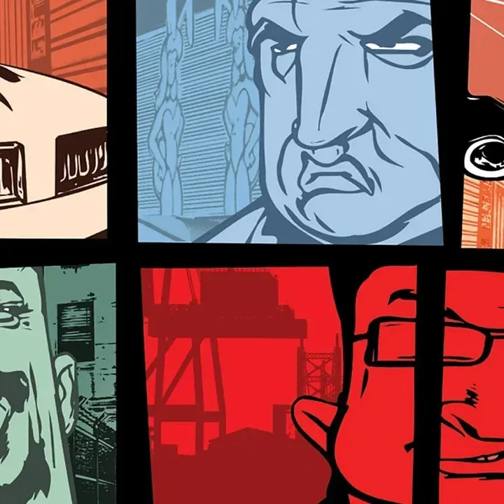
Stephen Bliss, the artist who helped shape the instantly recognizable promotional look of Grand Theft Auto during his years at Rockstar Games, has reflected on the visual legacy that continues into Grand Theft Auto 6. Bliss said he was flattered to notice design details in the new game's cover art that resemble conventions he helped develop for the series, including the familiar panel-based composition and the placement of a helicopter in the upper-left area.
Speaking during Lucca Comics and Games, Bliss made clear that he did not work on the GTA 6 art itself. Instead, his reaction was one of appreciation for seeing parts of a long-running visual tradition endure after he left Rockstar. He worked at the company from 2001 until 2016, a period that covered several defining entries in the franchise and helped cement the illustrated, character-driven collage style associated with its marketing.
"Well, I looked at the GTA 6 cover, for example. I had nothing to do with that, but the fact they still use the box grid and they still put the helicopter in the top left corner, which was something that I developed, I'm flattered by that," Bliss said.
For Bliss, those details are not a claim of authorship over the newly created image. They are signs that a visual language, built and refined by many people over many years, has remained useful to the series. He described the continuation as meaningful while emphasizing that the new piece belongs to the artists who made it.
For useful background on this topic, read Pokémon Happy Meals Return to McDonald's on November 10 With Cards, Toys and Regional Differences.
"It touches me that that heritage continues. And my influence is in the GTA 6 cover, but it's its own language. I just have little references in there. I'm like, 'Oh, that's nice that they used that.' But I'm absolutely not saying I contributed to that massively."
A Style That Became Synonymous With Grand Theft Auto
The grid-based Grand Theft Auto presentation is among the most enduring visual signatures in modern games marketing. Rather than centering every campaign around a single hero or one scene, the artwork commonly assembles a range of people, vehicles, settings, symbols, and pieces of regional atmosphere. The result gives viewers a quick impression of a game world that is sprawling, volatile, and full of intersecting stories.
That approach has been especially suited to a franchise built around open cities and ensembles of characters. A single image can present a lead character's face alongside a muscle car, law-enforcement imagery, a nightclub scene, a skyline, or an aircraft. Even before a player knows the story, the arrangement communicates a sense of place and scale.
Bliss was instrumental in establishing the comic-book-influenced character of that material. The illustrations are often bold, colorful, and stylized rather than attempting strict photorealism. Their visual energy has allowed different Grand Theft Auto games to feel connected while still giving each setting its own personality. The sun-soaked pastels and heightened 1980s mood of Vice City, for instance, call for a different palette and atmosphere than the urban tension of Grand Theft Auto III or the broader regional scope of San Andreas.
As a result, the series' box art is more than packaging. It has become a form of shorthand. The panel grid immediately tells audiences that they are looking at Grand Theft Auto, even as the faces, locations, fashion, vehicles, and color choices change from one era to the next.
Bliss Credits a Wider Team
Although Bliss is widely associated with the franchise's artwork, he was careful not to frame its history as the achievement of one person. He highlighted the work of fellow Rockstar artists Anthony Macbain and Steven Olds, recognizing that the identity of a major series is formed through collaboration rather than a solitary signature.
That distinction matters particularly with a property as long-lived as Grand Theft Auto. A recognizable style can survive because new artists understand its foundations and reinterpret them, not because every later image merely repeats an old formula. Bliss's comments on the GTA 6 cover point to that balance: recurring compositional motifs can honor what came before, while the overall work can still speak in a contemporary voice and reflect a new game's setting, cast, and tone.
The helicopter example is a small but revealing one. Vehicles have always held a prominent place in Grand Theft Auto imagery because movement, spectacle, and the promise of an expansive city are central to the games' appeal. Positioning such an element in a recurring location within the composition can create an intentional visual echo for long-time fans. It is a detail that may not stand out to everyone, but it represents the kind of design continuity Bliss recognized immediately.
Ten Years of Work Beyond Rockstar
Bliss departed Rockstar in 2016 and has spent the decade since building an artistic identity outside the studio. Even so, he remains appreciative of the time he spent contributing to one of gaming's most famous visual brands. His remarks suggest a healthy separation between his past work and the franchise's current direction: he can be proud of ideas he helped establish without claiming ownership of every future use or evolution of them.
That perspective also reflects how creative legacies work in games. Development teams change, technologies evolve, and each new installment brings its own production demands. Yet the strongest franchises often preserve some recognizable design principles, whether in logos, music, interfaces, promotional art, or the way their worlds are introduced. In the case of Grand Theft Auto, the illustrated panel format has become one of those durable principles.
For an artist, seeing a design decision remain visible years after leaving a project can be an unusual kind of validation. Bliss's response was not that GTA 6 is attempting to recreate the past wholesale. Instead, he saw a few familiar references inside artwork that has its own purpose. That distinction keeps the focus on both continuity and change.
The Creative History Behind GTA's Promotional Art
Bliss's wider discussion also revisited the circumstances and creative challenges surrounding earlier Grand Theft Auto artwork. Among the topics addressed was the way the September 11 attacks affected the cover art for Grand Theft Auto III. The game arrived during a period when imagery connected to urban skylines, aviation, and city life carried particularly heightened cultural weight, making visual decisions more complicated than they might have been under ordinary circumstances.
The conversation also covered the distinct artistic hurdles involved in shaping Vice City and San Andreas. Both games needed to be recognizably part of the same wider series while presenting dramatically different cultural moods. Vice City leaned into a vivid, stylish reinterpretation of 1980s Miami-inspired excess, whereas San Andreas had to convey a much broader setting and a different set of social, musical, and regional influences.
Those challenges help explain why the franchise's visual identity has endured. The panel layout creates a flexible framework rather than a rigid template. It can hold different protagonists, different cities, and different eras without losing the broader sense of visual unity. A series that has repeatedly reinvented its fictional locations and characters needs that adaptability.
Why Familiar Details Matter for GTA 6
Anticipation around Grand Theft Auto 6 naturally puts intense attention on every piece of official artwork. Fans scrutinize composition, characters, colors, vehicles, and background details for hints about the game's identity. Bliss's comments add a historical perspective to that close reading: some details that appear simple on the surface are part of a design vocabulary developed across decades.
At the same time, his insistence that the new cover is "its own language" is important. The strength of an established style is not that it prevents evolution. It is that it gives artists a foundation from which to create something new. Familiar structural cues can provide instant recognition, while the individual panels and overall mood establish what makes the next entry distinct.
Bliss's reaction ultimately offers a concise endorsement of that approach. He sees traces of his past work in the continuing Grand Theft Auto visual tradition, appreciates the acknowledgment implicit in those echoes, and gives credit to the artists currently carrying the series forward. For a franchise whose artwork has become almost as recognizable as its logo, that kind of continuity is a meaningful part of what makes each new reveal feel like Grand Theft Auto.
Community
Discussion
Start the conversation.
No comments have been posted yet.