

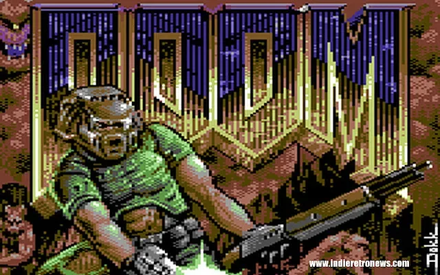
A new Commodore 64 release is taking on one of gaming's most famously demanding first-person shooters--not by attempting an impossible one-to-one port, but by making carefully chosen technical compromises that suit the machine. DOOM64, created by Kweepa, launched in its final form on September 30 and is now available through Itch.io. It is an ambitious Doom-inspired demake designed around the visual language, storage constraints, and processing limits of Commodore's 8-bit home computer.
Despite the potentially confusing title, DOOM64 is not a conversion of Nintendo 64's Doom 64. Instead, it is Kweepa's attempt to reinterpret the 1993 PC original for the Commodore 64. The project is the second entry in a planned trilogy of id Software-inspired conversions for classic Commodore systems. Kweepa previously produced a version of Doom for the even more restricted VIC-20, a machine with substantially less memory and capability than the C64.
That earlier VIC-20 project demonstrated that Doom's basic rhythm--moving through hostile mazes, finding keys, opening doors, and fighting demons--could be translated to extraordinarily humble hardware. The Commodore 64 version has a different set of priorities. Rather than simply repeat the VIC-20 approach with more detail, the developer reworked the rendering trade-offs to make the new game feel more like a distinct step forward.
Choosing elevation over angled walls
The central compromise behind DOOM64 is straightforward but important. Kweepa removed off-axis walls, meaning the game does not devote its limited performance budget to presenting the kinds of diagonal architecture associated with Doom's original engine. In return, that computing time can be used for dynamic changes in floor and ceiling height.
For useful background on this topic, read Lemans 2 Version 1.3c Brings a New Full-Screen Cover to Commodore 64 Racing.
That decision gives the game a stronger sense of verticality than a simple flat maze renderer could offer. Height changes are a major ingredient in the feel of classic Doom levels, whether they are used for raised platforms, descending corridors, steps, pits, or rooms with different ceiling levels. On a Commodore 64, where every visual feature competes for a very small pool of processing resources, retaining those environmental shifts is a notable design choice.
The result is not intended to be a literal recreation of the PC game's technology. It is a new interpretation of Doom's spatial ideas within an 8-bit framework. The absence of diagonal walls is visible, but it also helps establish a clear rule set for the world. Players get environments that can vary in height and mood without the machine being overwhelmed by a more complex geometric presentation.
Lighting is built from the C64 display itself
Another key part of the project is how it handles darkness and illumination. The Commodore 64's display operates in a 40-by-25 text layout, a characteristic that would seem far removed from Doom's original graphics. DOOM64 turns that constraint into one of its main visual tools by updating the text display with dithered shading patterns.
Rather than relying on conventional high-detail texture rendering, the game uses those patterns to suggest lighting changes across its environments. Dithering can create the impression of additional shades or depth through carefully arranged pixels and color combinations. In this case, it allows dark passages, shadowed areas, and changing light levels to communicate atmosphere without requiring the hardware to draw richer textures at every moment.
It is a particularly fitting technique for a Doom adaptation. The 1993 game was celebrated not only for speed and combat, but for the mood created by its flickering, oppressive bases and demon-infested darkness. DOOM64's lighting solution is necessarily different, yet it aims at the same broad emotional effect: making each corridor feel uncertain and each threat difficult to read at a glance.
Why texture mapping was left behind
Full texture mapping was deliberately excluded from the project. That may initially sound like a major omission for something based on Doom, whose walls, floors, switches, and doors are closely tied to their textures. But the decision was made to avoid a result that would appear muddy and excessively low-resolution on the C64.
By declining to force full texture mapping onto the machine, Kweepa avoided spending valuable memory and performance on imagery that might not have been legible or attractive at the system's limits. Those saved resources could then be directed elsewhere: custom lookup tables, enemy mipmaps, and a native soundtrack.
That reveals the broader philosophy behind the demake. It is less concerned with checking off every visual feature from the PC version than with making each retained feature useful. A reduced visual vocabulary can be more effective when enemies remain identifiable, lighting remains readable, and motion is consistent. For a project on hardware of this era, restraint is often what makes the final game convincing.
Enemy presentation benefits from that approach. Mipmaps, which provide alternate versions of an image for different apparent distances or scales, help sprites remain more manageable as their size changes on screen. This is one of many areas where the game is working toward the illusion of a 3D shooter rather than trying to replicate the original engine's exact methods.
Maps designed one frame at a time
The level construction process was also custom-built for the project. Maps were assembled frame by frame on a grid using an editor made specifically for this workflow. The editor includes immediate preview functions, allowing Kweepa to check how elevation and shadow choices would appear while creating an area.
That kind of rapid feedback is significant for a game that leans so heavily on spatial readability. A map may look sensible as a collection of grid cells, but its floor heights and darkened regions can feel very different from the player's viewpoint. Instant previews make it easier to judge whether a route is understandable, whether a raised area is visually distinct, or whether shadows obscure too much of the action.
It also underlines the amount of bespoke work that goes into a demake of this sort. The finished game may evoke a well-known 1993 release, but its content has to be reconstructed through tools and systems that fit entirely different technology. Each corridor, combat space, and lighting transition has to serve the capabilities of the Commodore 64 renderer.
Classic weapon art and heavily reduced sound effects
DOOM64's weapons draw from the PC shareware release, though they have been extensively adjusted for their new home. The weapon sprites were hand-tweaked, recolored, and rescaled to work within the C64's visual limitations. Using familiar source imagery helps preserve the identity of Doom's arsenal, while the manual revisions ensure those assets function in the game's own display style.
The audio takes a similarly pragmatic path. Kweepa has said that the sound effects originate from the original PC speaker effects, then undergo decimation for use in this version. That method had already been used for the VIC-20 release. It is an appropriate match for a Commodore project that is not attempting to imitate modern audio fidelity, but instead seeks recognizable, stripped-down feedback for shots, impacts, doors, and enemies.
Alongside those reduced effects, the game includes a native soundtrack. The combination should give the release a more complete identity than a purely visual experiment. Doom's tension depends on its audiovisual pacing, and a tailored C64 score gives this adaptation a chance to create its own version of that pressure.
Two editions for different C64 setups
Kweepa has released DOOM64 in two distinct versions, addressing the very different ways people use Commodore 64 software today. One standard edition is intended for modern emulators and for hardware fastloaders, including C64 Ultimate systems. That version is suited to players who want convenient loading through contemporary tools or enhanced C64 hardware.
A second edition uses Krill technology and is designed specifically to get the best possible disk loading performance from an unmodified, standard Commodore 64 setup. This is an especially thoughtful inclusion for enthusiasts who want to experience the game on original hardware without relying on upgraded drives or modern loading devices.
The package also features a loading splash screen by digital artist Paul Docherty, known as d0kk!. It is a final presentation touch that helps the release feel like a purpose-built C64 game rather than merely a technical demonstration.
A demake built around the right questions
DOOM64 stands out because it recognizes that bringing Doom to an 8-bit computer is not just a matter of cutting resolution until something runs. The more interesting task is deciding what must remain for the game to feel Doom-like and what can be reimagined. Here, vertical spaces, shifting light, recognizable weapons, enemies, sound cues, and fast navigation appear to matter more than preserving every rendering feature of the original.
For Commodore 64 fans, it is another striking example of how much creativity remains in the platform's homebrew scene. For Doom enthusiasts, it offers a chance to see the classic shooter filtered through a radically different design and technical perspective. The final release may be constrained by the C64 in every direction, but those limits are exactly what make its solutions worth examining.
Community
Discussion
Start the conversation.
No comments have been posted yet.