

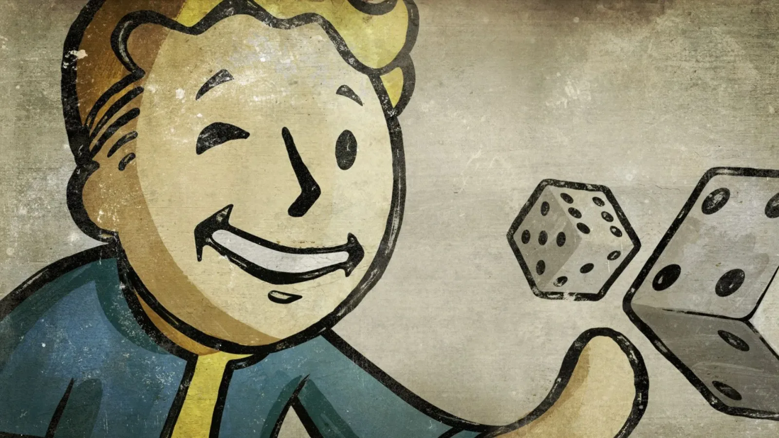
Vault Boy is now inseparable from Fallout. The smiling, thumbs-up-giving mascot appears on loading screens, perk art, manuals, advertisements, collectibles, and just about every piece of merchandise connected to the long-running post-apocalyptic series. Yet the character was not initially conceived simply as a branding tool. His creation came from a very practical problem facing the developers of the original 1997 PC role-playing game: how could players quickly understand a huge number of character traits when there was not always enough room for text?
In a new video, original Fallout lead Tim Cain has discussed how the early version of the game was planned around the Generic Universal Role-Playing System, better known as GURPS. The tabletop system, published by Steve Jackson Games, offered a wide range of character elements, including skills, advantages, disadvantages, and quirks. That flexibility was useful for an RPG, but it created a daunting interface and presentation challenge for a computer game.
The team needed players to identify those many characteristics quickly. In menus, a full title and explanation could be displayed. In more restricted spaces, however, text would be less practical. The early solution was to build a distinct icon for every attribute and use that image next to a trait's name, or in places where a compact visual shorthand was needed.
A mountain of icons for an early Fallout build
Creating that icon library became the responsibility of artist Arlene Summers, whose work on the early version of Fallout has, Cain said, received far too little recognition over the years. The scale of the task was substantial. Cain recalled that the team produced more than 100 icons and possibly close to 200 once every relevant characteristic was counted.
For useful background on this topic, read Dressmaker Turns Character-Creator Fashion Into a Full Crafting Fantasy.
That is an enormous number of symbols to ask players to remember, particularly in an era when game interfaces had far less display space than modern RPGs. The icons had to be readable at a glance, visually separate from one another, and useful in a variety of contexts. If two images looked too alike, they failed at the exact job they were made to do.
There was another important consideration. Cain was beginning to lose his color vision during the period, so he urged Summers not to make color the key distinction between icons. The images needed to communicate through shape, pose, and immediate visual meaning rather than through palettes alone. That was a sensible accessibility-minded direction, but it made the effort even harder. Designing a few clear symbols is manageable; designing hundreds that remain unmistakable without relying on color is an entirely different challenge.
The growing difficulty exposed a limitation in the original approach. A conventional icon could represent a gun, a lock, or a fist. But a sprawling list of skills, personality-related traits, drawbacks, and special modifiers becomes much tougher to translate into tiny abstract pictures. Eventually, the project needed a different visual language.
Leonard Boyarsky's cartoon answer
The breakthrough came from art director Leonard Boyarsky. Rather than continuing to fill the game with increasingly complicated standalone icons, Boyarsky proposed using a cartoon figure that could act out a skill or embody the attribute being described. In the Skilldex, the game's reference area for abilities and their descriptions, this character could provide a more expressive visual cue than a small symbol ever could.
Cain said Boyarsky drew inspiration from Monopoly's Rich Uncle Pennybags, the character now commonly known as Mr. Monopoly. The idea was not to duplicate that mascot, but to use the recognizable language of a cheerful, old-fashioned cartoon pitchman as a starting point. Boyarsky sketched the concept, and the team responded positively to it.
That decision did more than solve a user-interface problem. It gave Fallout a visual contrast that became central to its identity. The series depicts a devastated future shaped by nuclear war, corporate excess, mutation, scarcity, and brutal choices. Against that backdrop, the clean-lined, upbeat cartoon figure feels deliberately strange. Vault Boy can appear excited about an ability, injured by a hazard, celebrating a perk, or demonstrating an action, all while retaining the same cheerful advertising-era style.
The contrast helps the art communicate quickly, but it also reinforces the setting's satire. A friendly mascot explaining violence, radiation, weaponry, and survival reflects the retro-futurist culture that Fallout built around its ruined America. What began as a solution for presenting character data became an efficient expression of tone.
From sketch to hundreds of Vault Boy illustrations
While Boyarsky originated the central idea and initial sketch, Vault Boy's final form was shaped by several artists. George Almond further refined the design. Tramell Ray Isaac then took on the extraordinary amount of final illustration work required to make the concept function throughout the game.
Cain said Isaac drew hundreds of Vault Boy images. That volume makes sense when considering how often the character appears in the original game. The mascot is present throughout the Skilldex, across the manual, and in the opening cinematic. Each pose needed to convey a particular skill, state, or concept without slowing down the player's understanding. A character representing lockpicking, for instance, required a different readable visual joke or action than one representing combat proficiency, medical knowledge, or a status effect.
This breadth is part of why Vault Boy endured. He was not limited to a logo on a box. From the start, he was woven into the game's systems and instructions. Players encountered him repeatedly while learning how their character worked. The mascot was therefore both decorative and functional: a guide through a complicated RPG ruleset, presented with a memorable personality.
Over time, that utility transformed into iconography. Vault Boy has since appeared on mugs, bobbleheads, and countless other licensed items, while newer games and adaptations have continued to use the image as a shorthand for the whole franchise. His modern ubiquity can make him seem inevitable, but the story behind his creation shows that he was a response to specific development constraints.
The mascot that helped end Fallout's GURPS plans
Vault Boy also became entangled in one of the original game's most consequential creative breaks. Early Fallout was intended to use GURPS, but the development team ultimately moved away from the licensed tabletop ruleset and created its own system. That replacement would become SPECIAL, one of the most recognizable mechanics in the franchise.
The separation involved more than one disagreement. A 1998 feature on the game's development described objections from Steve Jackson, including concerns about violence in the opening cinematic, the game's small-scale character presentation, and the Monopoly-inspired mascot. Cain has now expanded on the Vault Boy portion of that conflict, explaining that Steve Jackson Games specifically asked for the character to be removed.
The developers explained the Monopoly reference behind the figure, but that did not resolve the concern. Cain said the company felt Vault Boy did not fit the game's tone. The objection extended to the character's use in the cinematic as well, alongside other aspects of that sequence that were not viewed favorably.
For the team, accepting those demands would have meant giving up a design that had already become useful creatively and structurally. Rather than proceed under those conditions, the developers abandoned GURPS and built a homegrown alternative. SPECIAL eventually emerged from that decision, organizing character creation around Strength, Perception, Endurance, Charisma, Intelligence, Agility, and Luck.
There is a striking irony in the result. The concerns over Vault Boy and other creative elements helped push Fallout away from the system it was originally expected to use. That split, in turn, cleared the way for both the mascot and SPECIAL to become defining pillars of the series. One was born from a need to make dozens upon dozens of RPG characteristics readable; the other came from the need to replace an external rules framework.
A reminder that famous game ideas can start as production fixes
Stories about game development often focus on grand concepts: worlds, characters, combat systems, or sweeping narrative plans. Vault Boy's origin is a useful reminder that some of the most lasting ideas arise from much smaller questions. In this case, the question was how to help players understand an unwieldy list of traits without drowning them in text or asking them to decode hundreds of nearly identical icons.
The answer was a cartoon character who could demonstrate the rules. The resulting mascot was practical, distinctive, flexible, and tonally unusual enough to become unforgettable. It also required the work of multiple artists, from Summers' extensive early icon effort to Boyarsky's concept, Almond's refinement, and Isaac's hundreds of finished drawings.
Nearly three decades after the first Fallout, Vault Boy remains one of gaming's clearest examples of interface design becoming cultural identity. He is a symbol of the series now, but he began as a clever way to make an old-school RPG easier to read.
Community
Discussion
Start the conversation.
No comments have been posted yet.