

The newly revealed remake of The Legend of Zelda: Ocarina of Time is giving fans plenty to scrutinize, from its newly expanded vistas to the ways it recreates some of the Nintendo 64 classic's most memorable characters and dungeon spaces. Following a Zelda Direct presentation that showed an extended early-game gameplay segment and a fuller trailer, viewers now have glimpses of many of the adventure's major locations rather than just a single promotional image.
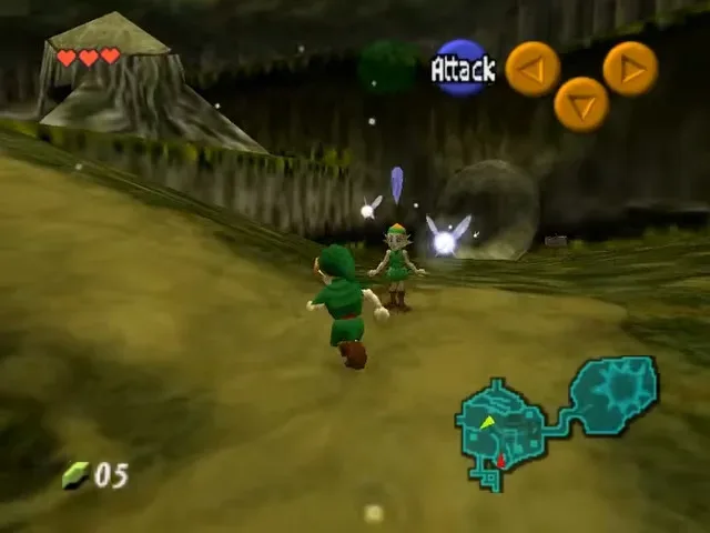
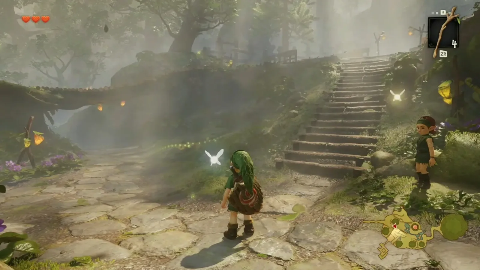
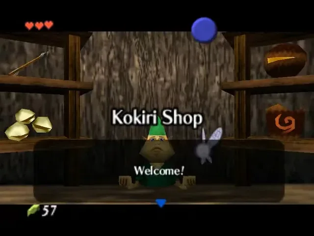
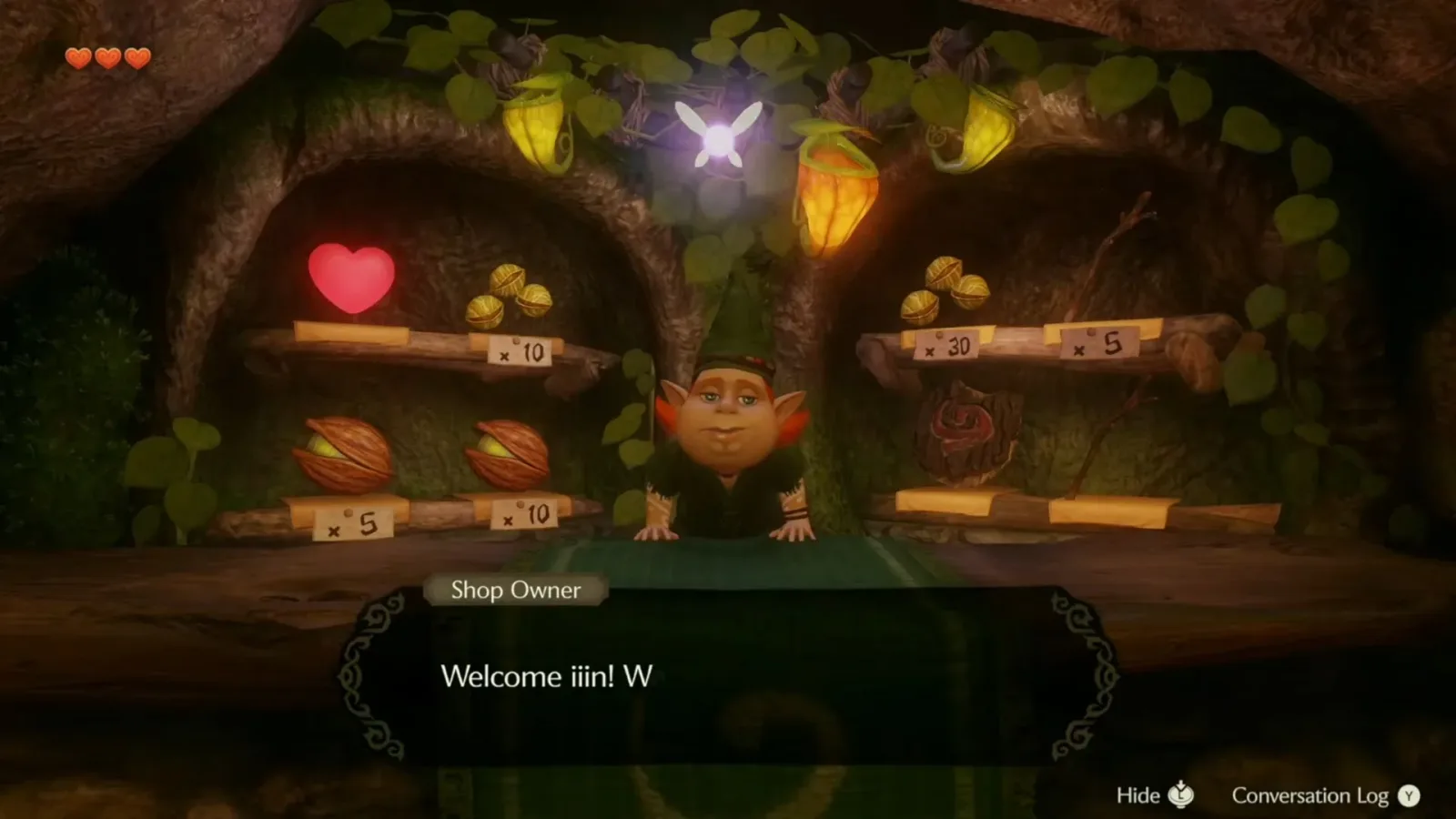
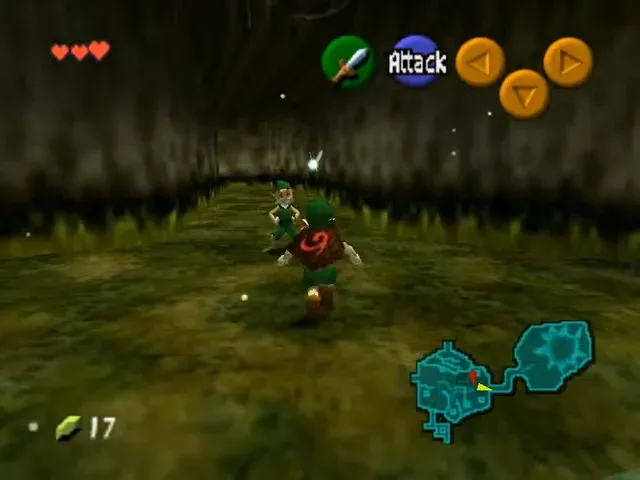
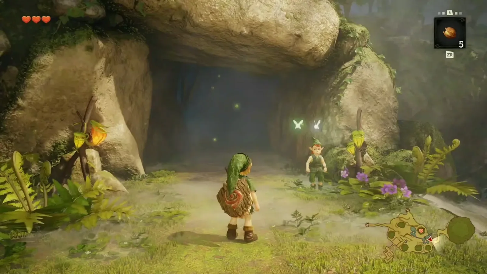
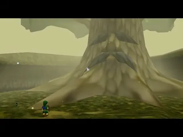
The additional footage has naturally led to side-by-side comparisons with the 1998 original. Looking at 25 roughly matching moments from the new material and the Nintendo 64 game makes the technological gap especially apparent. The remake has the difficult task faced by all high-profile revisits of foundational games: it must make Hyrule feel dramatically more detailed and contemporary while preserving the shapes, staging and visual identities that players remember.
On the evidence shown so far, the remake appears willing to broaden the scale of several famous spaces. At the same time, it retains recognizable design cues in areas such as the Great Fairy's domain. That push and pull between modernization and preservation may become one of the most interesting parts of the project when it arrives for Nintendo Switch 2 on November 5, 2026.
From one image to a much larger look at Hyrule
Prior to the Direct, the public had seen remarkably little of the remake. The new presentation changed that quickly. Its gameplay sequence concentrated on the early portion of Link's journey, while the trailer expanded the tour with glimpses of locations and scenes from much farther into the quest. Taken together, the material gives a much clearer sense of the visual direction than an isolated screenshot ever could.
For useful background on this topic, read Unico's Traveller ULw10 Retro-Style LCD Monitor Clears $100,000 in Its First Day.
That matters with Ocarina of Time in particular. It is one of the most frequently revisited games in Nintendo's catalogue, and its locations have become instantly legible to generations of players. Kokiri Forest, Hyrule Field, Castle Town, Zora's Domain, the interior of Jabu-Jabu and the Great Fairy Fountain are not merely backdrops. Their layouts, color palettes and camera framing are strongly tied to the original game's sense of discovery.
The new version is operating with technology far beyond the limitations of Nintendo 64 hardware. The original used carefully controlled camera angles, fogging and compact sightlines to suggest a much larger world. That was an extraordinary accomplishment for its era, but it also meant that its broadest environments had hard limits on how much could be shown at once.
The remake's footage instead presents Hyrule with substantially longer views and more environmental detail. The difference is not simply sharper textures or denser geometry. It changes how locations are introduced, how landmarks sit in the distance and how much of the surrounding world the player can read in a single shot.
Hyrule Field gets a more dramatic introduction
One of the clearest contrasts comes from Hyrule Field. The original game did not open onto one enormous, uninterrupted panorama in the way the remake footage does. In the updated version, the view outward has the kind of sweeping, scenic emphasis that modern Zelda players may associate with later open-air entries.
It is an understandable showcase moment. Hyrule Field was always central to Ocarina of Time, acting as the hub that connected the game's regions. Yet the Nintendo 64 version could only imply an immense kingdom through its routes, distant landmarks and transitions. A remake can make that scale more immediately visible, letting the journey beyond the starting area feel larger before the player has even begun exploring it.
That does not necessarily mean the game has been converted into an open-world experience. The footage demonstrates a wider presentation, not a confirmed redesign of the adventure's overall structure. Still, the expanded vista shows how a remake can use modern rendering to reinterpret the emotional purpose of a classic scene. The original communicated possibility through suggestion; the new version can communicate it through a literal view across the land.
For longtime fans, this raises an appealing question: how often will the remake preserve the original's directed framing, and how often will it pull back to reveal more of the surrounding landscape? The answer could affect the atmosphere of nearly every major arrival in Hyrule.
A freer camera changes familiar towns and rooms
Castle Town is another useful example of why direct image matching can be complicated. The remake appears to use a freer camera, allowing scenes to be viewed from angles that the original game did not offer. As a result, comparing a new shot to the precise Nintendo 64 equivalent is not always possible, even if the same district, shopfront or plaza is clearly being shown.
Camera freedom can make a major difference in a game built around landmark spaces. Castle Town in the original was bustling and distinctive despite its technical constraints, but its presentation was heavily shaped by fixed or tightly managed viewpoints. A more flexible perspective can make it feel like a physical place with more depth, while also making it harder to judge each redesign solely through a one-to-one screenshot.
The same is true of smaller interiors. Details that were once obscured, compressed or framed for readability may now be fully visible. One humorous example from the comparison material concerns a counter area where a character can now properly see over the top. It is a small change, but it reflects the broader shift. Higher-fidelity environments alter proportions, sightlines and the relationship between characters and their surroundings.
These differences are part of what makes remake comparisons so compelling. They are not just technical before-and-after images. They reveal how old level design was shaped by the tools available at the time, including draw distance, camera restrictions and the need to make every important object legible on a much lower-resolution display.
Dungeons face the greatest visual test
Outdoor areas can benefit immediately from higher-detail terrain and distant scenery, but dungeons may be where the remake's visual approach faces its toughest challenge. Ocarina of Time is celebrated for turning a wide variety of strange places into playable puzzle spaces, and few are stranger than Jabu-Jabu's interior.
The footage suggests that the inside of Jabu-Jabu is returning with far more visual complexity. That should make the biological setting feel more vivid, but it also highlights the risk of over-detail. The original often used bold, simple forms and strongly differentiated surfaces to keep navigation understandable. In an intricate remake, dense decoration, improved materials and more dramatic lighting could potentially make a deliberately bizarre dungeon harder to parse.
Whether that becomes a real issue will depend on how the final game handles navigation aids, lighting and environmental landmarks. A dungeon can be visually impressive without necessarily being easy to read. The strongest remakes understand that clarity is part of the original design language, especially in spaces where players are expected to remember doors, switches, routes and puzzle elements.
Other interior moments show a different side of the upgrade. Hallways and architectural sequences that once served as impressive technical showcases naturally look less miraculous by contemporary standards, but they can still be effective when rebuilt with strong lighting and atmosphere. The point is not to recreate the exact surprise of seeing an ambitious 3D corridor in 1998. It is to retain the tension, scale and mood that made the space memorable in the first place.
Classic visual identities remain important
Not every part of the remake appears to be aiming for a radical reinterpretation. The Great Fairy, for example, remains close to the character's familiar original appearance. That is notable because the Great Fairy is one of the more unusual and unmistakable visual elements in the game. Changing her too aggressively would likely have produced an immediate and polarizing reaction.
Keeping that connection intact suggests an awareness that faithfulness is not only about copying a dungeon map or retaining a line of dialogue. It can also mean preserving a character silhouette, an odd facial expression, a burst of color or a slightly surreal design choice. These are the details that help a remake feel like the same game rather than a completely separate fantasy adventure using familiar names.
The footage also points to updates in Link's movement. Most notably, Link can swim in the remake. The original's water traversal was notably more limited, so this is a meaningful change even if the full implications have not yet been explained. It could make watery areas feel smoother and more natural to play, though it remains unclear how broadly swimming will alter exploration, puzzle design or the structure of specific locations.
Comparison is only the beginning
Side-by-side shots are a useful way to appreciate the distance between eras, but they cannot answer every question about this remake. Visual upgrades can show the new scale of Hyrule Field, the expanded detail of Castle Town and the reworked atmosphere of dungeons. They cannot yet establish how controls feel, whether pacing has changed, how the revised camera behaves during combat, or how far new traversal options such as swimming extend.
There is also an important distinction between visual fidelity and emotional fidelity. Many players remember the original Ocarina of Time not because every environment looked realistic, but because its limitations helped give it a specific dreamlike character. Foggy distances, simple textures and carefully chosen camera views created a version of Hyrule that was stylized, readable and unforgettable.
The remake will be judged on whether it can preserve that feeling while offering a version of the world that looks at home on Nintendo Switch 2. The newly revealed footage gives fans a lot more evidence to examine, and the comparisons show a project that is clearly not content to merely raise the resolution. It is rebuilding famous moments around a different technological baseline while keeping many of their most recognizable ideas in view.
The Legend of Zelda: Ocarina of Time remake launches November 5, 2026, for Nintendo Switch 2.
Community
Discussion
Start the conversation.
No comments have been posted yet.