

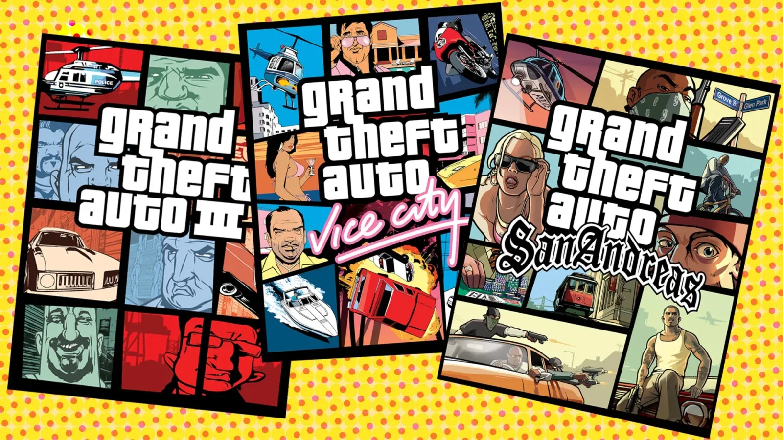
The visual language of Grand Theft Auto is so familiar that it is easy to assume it was always part of the plan. The grid of illustrated faces, cars, weapons, helicopters, city skylines, and sun-drenched locations has appeared across the series for decades. It is shorthand for the franchise at this point: a few square panels can immediately communicate a new setting, a cast of dangerous personalities, and the sprawling criminal fantasy waiting inside the box.
But that signature look was not originally intended for Grand Theft Auto 3, the game that introduced it. Former Rockstar vice president and lead writer Dan Houser has said the design emerged under intense time pressure in the wake of the September 11, 2001 terrorist attacks. With GTA 3 nearing release the following month, Rockstar reconsidered material that had previously seemed acceptable. The replacement cover, created by artist Stephen Bliss in roughly two evenings, would go on to define one of gaming's most recognizable visual identities.
A Last-Minute Change With a Lasting Effect
Houser explained that the earlier GTA 3 cover included burning buildings. In a different moment, he felt that artwork could have been released without issue. The immediate aftermath of 9/11 changed the context completely. The images no longer felt suitable for a major commercial game arriving so soon after the attacks.
That meant the team needed a new direction at the last minute. Rather than simply adjust the old composition, Bliss created the segmented design that players now associate with the series. Its individual squares and sharply separated illustrated elements gave the game a distinctive look while also moving away from imagery that had become especially fraught.
For useful background on this topic, read Kaz Hirai Explains the Independent Streak That Defined His PlayStation Leadership.
It is a striking example of how a creative decision made under practical pressure can become inseparable from a brand. The panel-based GTA cover was not presented as a years-long strategy, nor as a carefully established visual system that had been planned across sequels. It was, by Houser's account, a swift solution to an urgent problem. Yet it proved adaptable enough to survive far beyond Liberty City.
Subsequent entries could use the format to introduce their worlds at a glance. A cover could place its central characters beside the cars, neighborhoods, fashions, police presence, and recreational excess associated with that chapter. The structure was flexible: it could be rearranged, recolored, expanded, and tailored to a different era without losing its immediate connection to Grand Theft Auto.
Changes Went Beyond the Box
The cover was not the only element reconsidered before GTA 3 shipped. Houser said there were portions of content that had seemed fine before September 11 but felt excessive in the exact circumstances surrounding the game's release. Rockstar removed or altered some of that material, edited a small number of dialogue lines, and carried out a rapid review of the game's content.
One previously discussed change involved the color of police cars. The specifics matter because they show that the response was not limited to a single marketing image. GTA 3 was already a provocative game about crime, violence, cars, police chases, and a fictional American city. The team had to decide where the line sat between preserving the game it had made and acknowledging a dramatically altered real-world atmosphere.
Those decisions did not turn GTA 3 into a different kind of game. It remained an open-world crime story built around player freedom, escalating missions, and a satirical metropolitan setting. But the late adjustments illustrate the unusual position the developers faced. A game designed for one cultural moment was suddenly set to arrive in another, and there was very little time to react.
For players looking back at GTA 3 now, it can be tempting to see its eventual box art as inevitable. That is precisely why Houser's account is so revealing. An aesthetic that now appears foundational to the franchise was tied to a specific historical moment and a quick production turnaround.
From Emergency Design to Pop-Culture Symbol
Houser also reflected on the strange scale of the image's cultural afterlife. Grand Theft Auto's logo, heads-up display elements, and cover-art format have all become widely imitated and referenced. The visual template appears not only in games advertising but also in fan creations, parody videos, clothing, posters, and tourist-shop merchandise.
That kind of recognition is rare. Plenty of successful games have memorable logos, but fewer have a packaging formula that people can identify even when the game's name is removed. GTA's framed collage has become a visual genre unto itself. A handful of outlined boxes containing a glamorous character, a sports car, a weapon, and an urban skyline can evoke the series almost instantly.
Its endurance is also connected to the nature of Grand Theft Auto itself. Each installment is built around a place that is both specific and broad: a fictional city or region with its own atmosphere, architecture, local stereotypes, radio culture, criminal hierarchy, and social satire. The cover grid is an efficient way to sell that density. It does not need to explain every plot thread. Instead, it offers a montage of possibilities.
That approach has helped the franchise maintain continuity even as its settings and technology have changed. GTA 3's Liberty City had very different technical limitations and storytelling ambitions from later games, but the cover style provided a bridge. It told audiences that each new release belonged to the same larger identity while still allowing the individual game to establish its own mood.
GTA 3's Slow-Burning Commercial Breakthrough
The story behind the artwork arrives alongside Houser's recollections of GTA 3's difficult path to success. He said Take-Two was in a precarious financial position during early 2001, while Rockstar was still struggling to finish the game. The developers believed they had something special, but an appearance on the E3 show floor did not immediately generate the attention they hoped for.
That lack of an instant convention response makes the game's eventual impact even more notable. GTA 3 launched in October 2001 and did not, in Houser's telling, explode through one singular, enormous sales week. Instead, it kept selling week after week through the holiday period and into early 2002. The momentum accumulated steadily.
That sustained performance transformed Rockstar into a household name and helped change Take-Two's fortunes. GTA 3's influence is often discussed in terms of game design: its open city, mission structure, radio stations, emergent chaos, and sense of player-driven exploration became reference points for a generation of developers. Its success was equally significant as a business story. A project developed amid pressure, uncertainty, and a shifting cultural landscape became a defining commercial hit.
The cover art sits at the center of that legacy because it was the first thing many players saw. Before they entered Liberty City, stole a car, heard a radio station, or discovered how freely the city could be explored, they encountered those segmented illustrations. What began as a rushed replacement became the public face of a major new era for the series.
The Design Will Continue With GTA 6
The format's longevity will extend into the next mainline entry. Grand Theft Auto 6 is set to continue using the familiar GTA cover-design approach when it arrives on November 19 for Xbox and PlayStation. That continuity is meaningful not because every installment must look identical, but because the visual structure has become part of the series' vocabulary.
There is an irony in that legacy. The image arrangement is now often treated as a polished, deliberate emblem of blockbuster gaming, reproduced so frequently that it can seem timeless. Houser's comments place it back in its original context: a design assembled quickly after the world changed, intended to replace art that no longer felt right to release.
For Stephen Bliss, creating the new cover in approximately 48 hours meant producing a solution under extraordinary constraints. For Rockstar and Grand Theft Auto, it meant discovering a style that outlived the immediate problem by decades. GTA 3 is remembered for changing what open-world games could be. Its box art, created in the shadow of an urgent real-world event, became one of the clearest symbols of that transformation.
Community
Discussion
Start the conversation.
No comments have been posted yet.